JS Tutorial
JS Version
JS Objects
JS Function
JS Classes
JS Async
JS HTML DOM
JS Browser BOM
JS Web API
JS AJAX
JS JSON
JS vs JQUERY
JS Graphics
JS Ploty
Plotly.js is defined as a charting library that comes with over 40 chart types, 3D charts, statistical graphs, and SVG maps.
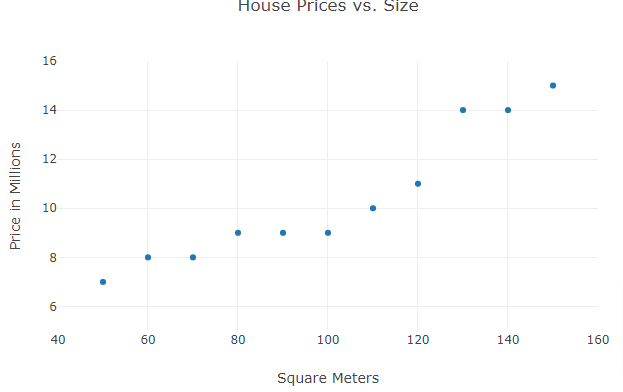
Scatter Plots
Example
<!DOCTYPE html>
<html>
<script src=”https://cdn.plot.ly/plotly-latest.min.js”></script>
<body>
<div id=”myPlot” style=”width:100%;max-width:700px”></div>
<script>
var xArray = [50,60,70,80,90,100,110,120,130,140,150];
var yArray = [7,8,8,9,9,9,10,11,14,14,15];
// Define Data
var data = [{
x:xArray,
y:yArray,
mode:”markers”
}];
// Define Layout
var layout = {
xaxis: {range: [40, 160], title: “Square Meters”},
yaxis: {range: [5, 16], title: “Price in Millions”},
title: “House Prices vs. Size”
};
// Display using Plotly
Plotly.newPlot(“myPlot”, data, layout);
</script>
</body>
</html>
Output
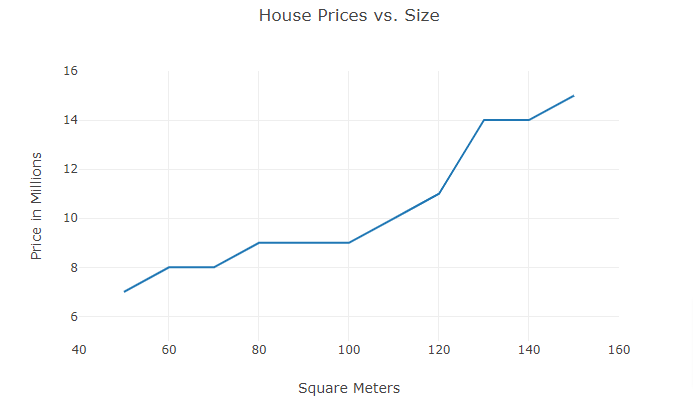
Another Example
<!DOCTYPE html>
<html>
<script src=”https://cdn.plot.ly/plotly-latest.min.js”></script>
<body>
<div id=”myPlot” style=”width:100%;max-width:700px”></div>
<script>
var xArray = [50,60,70,80,90,100,110,120,130,140,150];
var yArray = [7,8,8,9,9,9,10,11,14,14,15];
// Define Data
var data = [{
x: xArray,
y: yArray,
mode:”lines”
}];
// Define Layout
var layout = {
xaxis: {range: [40, 160], title: “Square Meters”},
yaxis: {range: [5, 16], title: “Price in Millions”},
title: “House Prices vs. Size”
};
// Display using Plotly
Plotly.newPlot(“myPlot”, data, layout);
</script>
</body>
</html>
Output
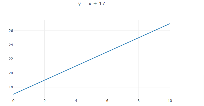
Linear Graphs
Example
<!DOCTYPE html>
<html>
<script src=”https://cdn.plot.ly/plotly-latest.min.js”></script>
<body>
<div id=”myPlot” style=”width:100%;max-width:700px”></div>
<script>
var exp = “x + 17”;
// Generate values
var xValues = [];
var yValues = [];
for (var x = 0; x <= 10; x += 1) {
xValues.push(x);
yValues.push(eval(exp));
}
// Define Data
var data = [{
x: xValues,
y: yValues,
mode:”lines”
}];
// Define Layout
var layout = {title: “y = ” + exp};
// Display using Plotly
Plotly.newPlot(“myPlot”, data, layout);
</script>
</body>
</html>
Output
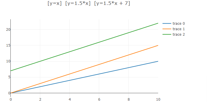
Multiple Lines
Example
<!DOCTYPE html>
<html>
<script src=”https://cdn.plot.ly/plotly-latest.min.js”></script>
<body>
<div id=”myPlot” style=”width:100%;max-width:700px”></div>
<script>
var exp1 = “x”;
var exp2 = “1.5*x”;
var exp3 = “1.5*x + 7”;
// Generate values
var x1Values = [];
var x2Values = [];
var x3Values = [];
var y1Values = [];
var y2Values = [];
var y3Values = [];
for (var x = 0; x <= 10; x += 1) {
x1Values.push(x);
x2Values.push(x);
x3Values.push(x);
y1Values.push(eval(exp1));
y2Values.push(eval(exp2));
y3Values.push(eval(exp3));
}
// Define Data
var data = [
{x: x1Values, y: y1Values, mode:”lines”},
{x: x2Values, y: y2Values, mode:”lines”},
{x: x3Values, y: y3Values, mode:”lines”}
];
//Define Layout
var layout = {title: “[y=” + exp1 + “] [y=” + exp2 + “] [y=” + exp3 + “]”};
// Display using Plotly
Plotly.newPlot(“myPlot”, data, layout);
</script>
</body>
</html>
Output
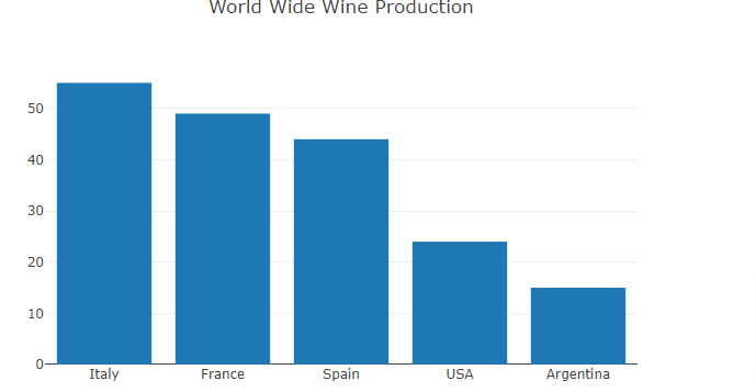
Bar Charts
Example
<!DOCTYPE html>
<html>
<script src=”https://cdn.plot.ly/plotly-latest.min.js”></script>
<body>
<div id=”myPlot” style=”width:100%;max-width:700px”></div>
<script>
var xArray = [“Italy”, “France”, “Spain”, “USA”, “Argentina”];
var yArray = [55, 49, 44, 24, 15];
var data = [{
x:xArray,
y:yArray,
type:”bar”
}];
var layout = {title:”World Wide Wine Production”};
Plotly.newPlot(“myPlot”, data, layout);
</script>
</body>
</html>
Output
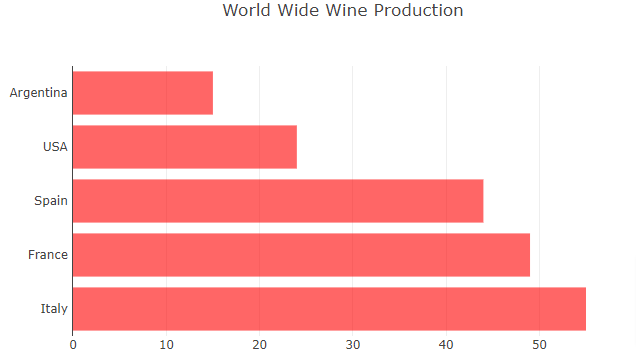
Horizontal Bar Charts
Example
<!DOCTYPE html>
<html>
<script src=”https://cdn.plot.ly/plotly-latest.min.js”></script>
<body>
<div id=”myPlot” style=”width:100%;max-width:700px”></div>
<script>
var xArray = [55, 49, 44, 24, 15];
var yArray = [“Italy “, “France “, “Spain “, “USA “, “Argentina “];
var data = [{
x:xArray,
y:yArray,
type:”bar”,
orientation:”h”,
marker: {color:”rgba(255,0,0,0.6)”}
}];
var layout = {title:”World Wide Wine Production”};
Plotly.newPlot(“myPlot”, data, layout);
</script>
</body>
</html>
Output
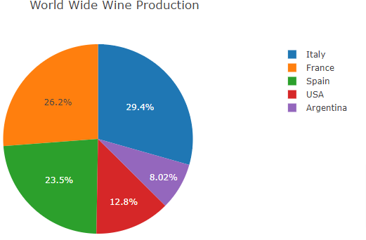
Pie Charts
To display a pie instead of bars, change x and y to labels and values, and change the type to “pie”:
Example
<!DOCTYPE html>
<html>
<script src=”https://cdn.plot.ly/plotly-latest.min.js”></script>
<body>
<div id=”myPlot” style=”width:100%;max-width:700px”></div>
<script>
var xArray = [“Italy”, “France”, “Spain”, “USA”, “Argentina”];
var yArray = [55, 49, 44, 24, 15];
var layout = {title:”World Wide Wine Production”};
var data = [{labels:xArray, values:yArray, type:”pie”}];
Plotly.newPlot(“myPlot”, data, layout);
</script>
</body>
</html>
Output
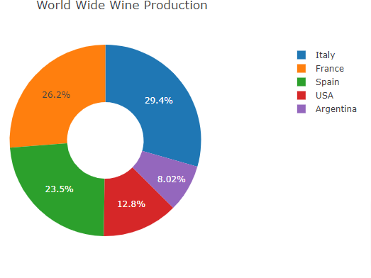
Donut Charts
To display a donut instead of a pie, add a hole:
Example
<!DOCTYPE html>
<html>
<script src=”https://cdn.plot.ly/plotly-latest.min.js”></script>
<body>
<div id=”myPlot” style=”width:100%;max-width:700px”></div>
<script>
var xArray = [“Italy”, “France”, “Spain”, “USA”, “Argentina”];
var yArray = [55, 49, 44, 24, 15];
var layout = {title:”World Wide Wine Production”};
var data = [{labels:xArray, values:yArray, hole:.4, type:”pie”}];
Plotly.newPlot(“myPlot”, data, layout);
</script>
</body>
</html>
Output
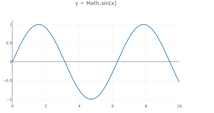
Plotting Equations
Example
<!DOCTYPE html>
<html>
<script src=”https://cdn.plot.ly/plotly-latest.min.js”></script>
<body>
<div id=”myPlot” style=”width:100%;max-width:700px”></div>
<script>
var exp = “Math.sin(x)”;
// Generate values
var xValues = [];
var yValues = [];
for (var x = 0; x <= 10; x += 0.1) {
xValues.push(x);
yValues.push(eval(exp));
}
// Display using Plotly
var data = [{x:xValues, y:yValues, mode:”lines”}];
var layout = {title: “y = ” + exp};
Plotly.newPlot(“myPlot”, data, layout);
</script>
</body>
</html>
Output