JS Tutorial
JS Version
JS Objects
JS Function
JS Classes
JS Async
JS HTML DOM
JS Browser BOM
JS Web API
JS AJAX
JS JSON
JS vs JQUERY
JS Graphics
JS Chart.js
Chart.js is a free JavaScript library for creating HTML-based charts. It is one of the simplest visualization libraries for JavaScript, and comes with the following built-in chart types:
How to Use Chart.js?
Chart.js can be easily used.
Add a link to the providing CDN (Content Delivery Network):
<script src=”https://cdnjs.cloudflare.com/ajax/libs/Chart.js/2.9.4/Chart.js”></script>
Add a <canvas> to where the chart needs to be drawn:
<canvas id=”myChart” style=”width:100%;max-width:700px”></canvas>
The canvas element should have a unique id.
Typical Scatter Chart Syntax
var myChart = new Chart(“myChart”, {
type: “scatter”,
data: {},
options: {}
});
Typical Line Chart Syntax
var myChart = new Chart(“myChart”, {
type: “line”,
data: {},
options: {}
});
Typical Bar Chart Syntax
var myChart = new Chart(“myChart”, {
type: “bar”,
data: {},
options: {}
});
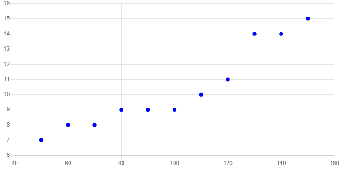
Scatter Plots
<!DOCTYPE html>
<html>
<script src=”https://cdnjs.cloudflare.com/ajax/libs/Chart.js/2.9.4/Chart.js”></script>
<body>
<canvas id=”myChart” style=”width:100%;max-width:700px”></canvas>
<script>
var xyValues = [
{x:50, y:7},
{x:60, y:8},
{x:70, y:8},
{x:80, y:9},
{x:90, y:9},
{x:100, y:9},
{x:110, y:10},
{x:120, y:11},
{x:130, y:14},
{x:140, y:14},
{x:150, y:15}
];
new Chart(“myChart”, {
type: “scatter”,
data: {
datasets: [{
pointRadius: 4,
pointBackgroundColor: “rgb(0,0,255)”,
data: xyValues
}]
},
options: {
legend: {display: false},
scales: {
xAxes: [{ticks: {min: 40, max:160}}],
yAxes: [{ticks: {min: 6, max:16}}],
}
}
});
</script>
</body>
</html>
Output
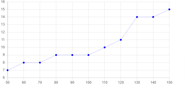
Line Graphs
Example
<!DOCTYPE html>
<html>
<script src=”https://cdnjs.cloudflare.com/ajax/libs/Chart.js/2.9.4/Chart.js”></script>
<body>
<canvas id=”myChart” style=”width:100%;max-width:600px”></canvas>
<script>
var xValues = [50,60,70,80,90,100,110,120,130,140,150];
var yValues = [7,8,8,9,9,9,10,11,14,14,15];
new Chart(“myChart”, {
type: “line”,
data: {
labels: xValues,
datasets: [{
fill: false,
lineTension: 0,
backgroundColor: “rgba(0,0,255,1.0)”,
borderColor: “rgba(0,0,255,0.1)”,
data: yValues
}]
},
options: {
legend: {display: false},
scales: {
yAxes: [{ticks: {min: 6, max:16}}],
}
}
});
</script>
</body>
</html>
Output
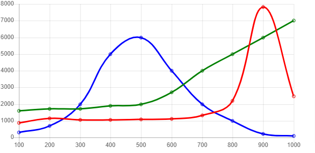
Multiple Lines
Example
<!DOCTYPE html>
<html>
<script src=”https://cdnjs.cloudflare.com/ajax/libs/Chart.js/2.5.0/Chart.min.js”></script>
<body>
<canvas id=”myChart” style=”width:100%;max-width:600px”></canvas>
<script>
var xValues = [100,200,300,400,500,600,700,800,900,1000];
new Chart(“myChart”, {
type: “line”,
data: {
labels: xValues,
datasets: [{
data: [860,1140,1060,1060,1070,1110,1330,2210,7830,2478],
borderColor: “red”,
fill: false
}, {
data: [1600,1700,1700,1900,2000,2700,4000,5000,6000,7000],
borderColor: “green”,
fill: false
}, {
data: [300,700,2000,5000,6000,4000,2000,1000,200,100],
borderColor: “blue”,
fill: false
}]
},
options: {
legend: {display: false}
}
});
</script>
Output
Bar Charts
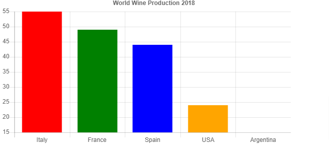
Example
<!DOCTYPE html>
<html>
<script src=”https://cdnjs.cloudflare.com/ajax/libs/Chart.js/2.5.0/Chart.min.js”></script>
<body>
<canvas id=”myChart” style=”width:100%;max-width:600px”></canvas>
<script>
var xValues = [“Italy”, “France”, “Spain”, “USA”, “Argentina”];
var yValues = [55, 49, 44, 24, 15];
var barColors = [“red”, “green”,”blue”,”orange”,”brown”];
new Chart(“myChart”, {
type: “bar”,
data: {
labels: xValues,
datasets: [{
backgroundColor: barColors,
data: yValues
}]
},
options: {
legend: {display: false},
title: {
display: true,
text: “World Wine Production 2018”
}
}
});
</script>
</body>
</html>
Output
Horizontal Bars
Example
<!DOCTYPE html>
<html>
<script src=”https://cdnjs.cloudflare.com/ajax/libs/Chart.js/2.5.0/Chart.min.js”></script>
<body>
<canvas id=”myChart” style=”width:100%;max-width:600px”></canvas>
<script>
var xValues = [“Italy”, “France”, “Spain”, “USA”, “Argentina”];
var yValues = [55, 49, 44, 24, 15];
var barColors = [“red”, “green”,”blue”,”orange”,”brown”];
new Chart(“myChart”, {
type: “horizontalBar”,
data: {
labels: xValues,
datasets: [{
backgroundColor: barColors,
data: yValues
}]
},
options: {
legend: {display: false},
title: {
display: true,
text: “World Wine Production 2018”
},
scales: {
xAxes: [{ticks: {min: 10, max:60}}]
}
}
});
</script>
</body>
</html>
Output
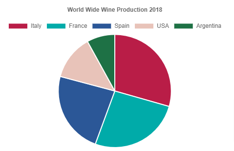
Pie Charts
Example
<!DOCTYPE html>
<html>
<script src=”https://cdnjs.cloudflare.com/ajax/libs/Chart.js/2.9.4/Chart.js”></script>
<body>
<canvas id=”myChart” style=”width:100%;max-width:600px”></canvas>
<script>
var xValues = [“Italy”, “France”, “Spain”, “USA”, “Argentina”];
var yValues = [55, 49, 44, 24, 15];
var barColors = [
“#b91d47”,
“#00aba9”,
“#2b5797”,
“#e8c3b9”,
“#1e7145”
];
new Chart(“myChart”, {
type: “pie”,
data: {
labels: xValues,
datasets: [{
backgroundColor: barColors,
data: yValues
}]
},
options: {
title: {
display: true,
text: “World Wide Wine Production 2018”
}
}
});
</script>
</body>
</html>
Output
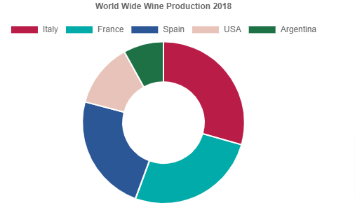
Doughnut Charts
Example
<!DOCTYPE html>
<html>
<script src=”https://cdnjs.cloudflare.com/ajax/libs/Chart.js/2.9.4/Chart.js”></script>
<body>
<canvas id=”myChart” style=”width:100%;max-width:600px”></canvas>
<script>
var xValues = [“Italy”, “France”, “Spain”, “USA”, “Argentina”];
var yValues = [55, 49, 44, 24, 15];
var barColors = [
“#b91d47”,
“#00aba9”,
“#2b5797”,
“#e8c3b9”,
“#1e7145”
];
new Chart(“myChart”, {
type: “doughnut”,
data: {
labels: xValues,
datasets: [{
backgroundColor: barColors,
data: yValues
}]
},
options: {
title: {
display: true,
text: “World Wide Wine Production 2018”
}
}
});
</script>
</body>
</html>
Output