CSS Tutorial
Menu
CSS Advanced
Menu
CSS Responsive
Menu
CSS Grid
Menu
CSS width and max-width
Using width, max-width and margin: auto;
A block-level element stretches up the full width available.
If the width of a block-level element prevents it from stretching out to the edges of its container. The margins are set to auto, to horizontally center the element inside the container. The element uses a specific width, and the space left will be split equally between the two margins.
Using max-width improves the browser’s handling of small windows. This enable the site to be usable on small devices:
HTML
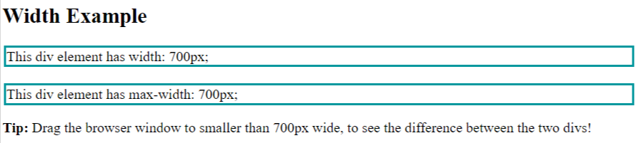
					<h2>Width Example</h2>
<div class="ex1">This div element has width: 700px;</div>
<br>
<div class="ex2">This div element has max-width: 700px;</div>
<p><strong>Tip:</strong> Drag the browser window to smaller than 700px wide, to see the difference between
the two divs!</p>
CSS
					div.ex1 {
  width: 700px;
  margin: auto;
  border: 3px solid #03989E;
}

div.ex2 {
  max-width: 700px;
  margin: auto;
  border: 3px solid #03989E;
}
Output