HTML Tutorial
HTML Forms
HTML Graphics
HTML Media
HTML API
HTML Responsive Web Design
Responsive web design means creating web pages that appear good on all devices
A good responsive web design automatically adjusts for different screen sizes and viewports.
What is meant by Responsive Web Design?
Responsive Web Design includes using HTML and CSS to automatically resize, hide, shrink, or enlarge, a website, to make it appear good on all devices (desktops, tablets, and phones):
<style>
.menu {
float: left;
width: 20%;
}
.menuitem {
padding: 8px;
margin-top: 7px;
border-bottom: 1px solid #f1f1f1;
}
.main {
float: left;
width: 60%;
padding: 0 20px;
overflow: hidden;
}
.right {
background-color: lightblue;
float: left;
width: 20%;
padding: 10px 15px;
margin-top: 7px;
}
@media only screen and (max-width:800px) {
/* For tablets: */
.main {
width: 80%;
padding: 0;
}
.right {
width: 100%;
}
}
@media only screen and (max-width:500px) {
/* For mobile phones: */
.menu, .main, .right {
width: 100%;
}
}
</style>
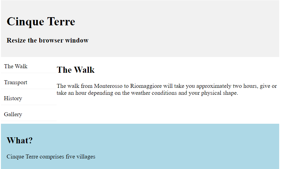
<div style="background-color:#f1f1f1;padding:15px;">
<h1>Cinque Terre</h1>
<h3>Resize the browser window</h3>
</div>
<div style="overflow:auto">
<div class="menu">
<div class="menuitem">The Walk</div>
<div class="menuitem">Transport</div>
<div class="menuitem">History</div>
<div class="menuitem">Gallery</div>
</div>
<div class="main">
<h2>The Walk</h2>
<p>The walk from Monterosso to Riomaggiore will take you approximately two hours, give or take an hour depending on the weather conditions and your physical shape.</p>
</div>
<div class="right">
<h2>What?</h2>
<p>Cinque Terre comprises five villages</p>
</div>
</div>
<div style="background-color:#f1f1f1;text-align:center;padding:10px;margin-top:7px;font-size:12px;"> Resize the browser window to see the content respond to the resizing.</div>
Output:
Setting The Viewport
Add the following <meta> tag to all the web pages, for creating a responsive website:
Example
<meta name="viewport" content="width=device-width, initial-scale=1.0">
Responsive Images
Responsive images are defined as those images that scale properly to fit any browser size.
Using the width Property
When CSS width property is set to 100%, the image is responsive and scales up and down:
Example:
<img decoding="async" src="img_mountain.jpg" style="width:100%;">
Using the max-width Property
When the max-width property is set to 100%, the image scales down if it has to, but never scales up to be larger than its original size:
Example:
<img decoding="async" src="img_girl.jpg" style="max-width:100%;height:auto;">
Show Different Images Depending on Browser Width
The HTML <picture> element defines different images for different browser window sizes.
By resizing, the browser window helps to see how the image below changes depending on the width:
Example:
					<picture>
  <source srcset="img_smallflower.jpg" media="(max-width: 600px)">
  <source srcset="img_flowers.jpg" media="(max-width: 1500px)">
  <source srcset="flowers.jpg">
  <img decoding="async" src="img_flowers.jpg" alt="Flowers" style="width:auto;">
</picture>
Responsive Text Size
The text size can be set with a “vw” unit, that refers to the “viewport width”.
Example
					<h1 style="font-size:10vw;">Responsive Text</h1>
<p style="font-size:5vw;">Resize the browser window to see how the text size scales.</p>
Media Queries
In addition, to resizing text and images, media queries are also used in responsive web pages.
Media queries allow you to define completely different styles for different browser sizes.
Example: resize the browser window to see that the three div elements below will display horizontally on large screens and stacked vertically on small screens:
Example
					/* Media Query for Mobile Devices */
        @media (max-width: 480px) {
            body {
                background-color: red;
            }
        }

        /* Media Query for low resolution  Tablets, Ipads */
        @media (min-width: 481px) and (max-width: 767px) {
            body {
                background-color: yellow;
            }
        }

        /* Media Query for Tablets Ipads portrait mode */
        @media (min-width: 768px) and (max-width: 1024px){
            body {
                background-color: blue;
            }
        }

        /* Media Query for Laptops and Desktops */
        @media (min-width: 1025px) and (max-width: 1280px){
            body {
                background-color: green;
            }
        }

        /* Media Query for Large screens */
        @media (min-width: 1281px) {
            body {
                background-color: white;
            }
        }
Bootstrap
The popular CSS framework is Bootstrap. Bootstrap includes HTML, CSS, and jQuery to make responsive web pages.
Example
					<link rel="stylesheet" href="https://maxcdn.bootstrapcdn.com/bootstrap/3.4.1/css/bootstrap.min.css">
  <script src="https://ajax.googleapis.com/ajax/libs/jquery/3.5.1/jquery.min.js"></script>
  <script src="https://maxcdn.bootstrapcdn.com/bootstrap/3.4.1/js/bootstrap.min.js"></script>
  </head>
<body>

<div class="container">
  <div class="jumbotron">
    <h1>My First Bootstrap Page</h1>
    <p>Resize this responsive page to see the effect!</p>
  </div>
  <div class="row">
    <div class="col-sm-4">
      <h3>Column 1</h3>
      <p>Lorem ipsum dolor sit amet, consectetur adipisicing elit...</p>
      <p>Ut enim ad minim veniam, quis nostrud exercitation ullamco laboris...</p>
    </div>
    <div class="col-sm-4">
      <h3>Column 2</h3>
      <p>Lorem ipsum dolor sit amet, consectetur adipisicing elit...</p>
      <p>Ut enim ad minim veniam, quis nostrud exercitation ullamco laboris...</p>
    </div>
    <div class="col-sm-4">
      <h3>Column 3</h3>
      <p>Lorem ipsum dolor sit amet, consectetur adipisicing elit...</p>
      <p>Ut enim ad minim veniam, quis nostrud exercitation ullamco laboris...</p>
    </div>
  </div>
</div>
Output:
